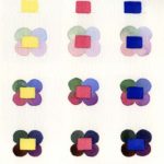
Choosing the color schemes for my paintings happens after a painting concept gels in my head and I have drawn a preliminary sketch. As I hone in on the ‘why’ of my concept and ‘what’ I am trying to express, I begin choosing my colors.
The color choices are endless and can be over whelming.
During my 25+ years of painting, I have often tried to skip this step and just dive into the painting. I grab this color and that, believing that my intuition knows what it is doing and will choose some delightful and harmonic colors.
However, I have learned – and re-learned – that if I do not choose a color scheme or even an approximate one from the very beginning, I end up with a mess. Painting decisions become difficult and the painting does not sing its song. I am also not a happy camper.
How do I choose a color scheme? The answer to the question, “Why am I painting X?” is my driving force. Once I know that, I then decide if the painting will have a warm or a cool dominance. Next I begin looking at various color scheme resources I have, or perhaps I have an example of a magazine photo that serves as my inspiration. TIP: Peruse interior design and art magazine for photos that feature color schemes you might like to use. I cut them out on a regular basis. Below is an example.
 The color scheme resources I referred to are various commercial color wheels I have purchased over the years. I can spin these to see color chords that are based upon: complementary colors, split complementary, triads, monochromatic and analogous colors. These are really helpful and also facilitates discovering color combinations you may not have thought of. The Ultimate 3-in-1 Color Tool is my favorite and is only $14.95.

Sometimes I also visit articles about the psychology of color. These provide content on how different colors impact us psychologically. All of us know the major ones, such as; 1) greens and blue convey calm and rest, and that, 2) oranges and reds convey energy. However you might be quite interested in learning more about the influence color has on us, not only on how we feel but also on what we buy. I highly recommend doing some research on the Internet. (Warning: be prepared to spend some time on this because you just might get hooked.)
I know, there are many artists who say this is too much work or that they don’t want to take the time. I understand this avoidance of making this color decision, but I believe it is a cop out. Often painters just return to the same ol’ color palette or two that they have always relied upon. This kind of habit has never appealed to me. I like to create a different palette for each of my paintings. It’s as if each one carries its own tune or musical chord. Just as each has its own unique title.
Remember, or in case you didn’t know this – color is the first element of your work that viewers respond to! After color, the other elements of design, line, form, etc., play their role.
When I was choosing color schemes for my recent series “Windows to Wellness,” I had an extra challenge. Because the subject of bones is or can be controversial, I knew I had to avoid some colors, such as red and lime green. The latter can be creepy and red can imply blood. The intent of this series of paintings is to inspire people to look at their bones differently – to see their beauty and vitality.
In the painting below, “Pickin’ the Pedicles,” I wanted it to convey a light hearted feeling with pastel harmonic colors. I used a split complementary color scheme with mostly light to middle values.

“Pickin’ the Pedicles,” 30x24x2 oil on canvas, $1,575.00
“Bone Appetit!” carries a more serious message. Because of the red soda can, I had to choose a color scheme that worked with the red, as well as conveyed a haunting feeling. I used a split complementary color scheme.
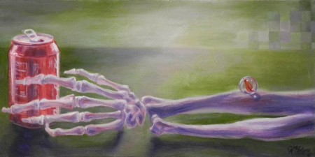
“Bone Appetit!” 16x8x2 oil on canvas, sold
Then for “A Spinal Journey,” you can see that I chose the complementary colors of blue and orange. I knew I wanted to create a glowing orange/salmon light at the end of the spinal. Choosing the blues was a natural fit. Not only because of how color opposites make each other stand out, but I could mix and use all of the various luscious browns that are created by mixing blue with orange.

“A Spinal Journey,” 48x36x2 on panel, $3,995.00
You are invited to visit my “Window to Wellness,” portfolio of paintings to see the various color schemes I applied. Or you are welcome to attend my upcoming show at the Cottonwood Center for the Arts, Colorado Springs. The opening reception is Sat., May 30th from 6-9pm. Everyone is invited.
How do you choose your color schemes? Or do you prefer not to make that decision before you begin painting? Share a few of your color decision making with us.
Please share this blog with your friends.